 As a Search Expert at Norconex, I am often assigned the task of integrating web accessibility standards within a search user interface for our customers in the government sector; these customers look to web accessibility to improve the overall search experience of their current enterprise’s search offering. And, of course, we have noticed a growing trend in the desire for search user interfaces that can respond to various screen sizes on various devices.
This post will look at the strategies I have used to design a web accessible search user interface and present why it is equally important to tackle a responsive web design. To illustrate an accessible response web design, I will demonstrate the Elections.ca website project that I have recently worked on with the Google Search Appliance (GSA).
If you are looking for ideas on design patterns for your search user interface, please read the blog “Search UI Showcase: The Search Box” at /search-ui-showcase-the-search-box.
Responsive Web Design and Accessibility
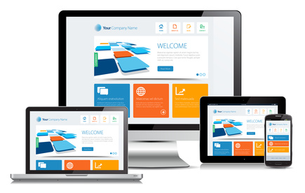
Both responsive web design and accessibility are ways of making a search user interface accessible to the widest possible audience, including people browsing the web using alternative technologies (e.g. screen readers or audio browsers), such as those used by people with disabilities, as well as devices such as mobile phones, tablets, etc. A Responsive Web Design (RWD) starts by thinking of a search page as a collection of elements that can be rearranged, not as a static layout. Accessibility starts by thinking about the different ways in which someone might interact with the search page and ensures that, no matter what senses a search user employs, the search page will work for them.
Responsive Web Design and accessibility are complimentary, but it is important to recognize that having responsive design does not mean that it translates automatically to an accessible search page, or vice versa. There are many areas of accessibility that have nothing to do with whether or not you have created a responsive design. But, if you are building a search user interface so that people using different devices are able to have a positive search experience, it is, in my opinion, a good start for accessibility.
It is easy to get caught up in web accessibility and web responsive design. There are a number of books written on the subject, and the Web is not short on opinions. In recent years, I’ve been fortunate to read recent posts on web accessibility and web responsiveness, but I won’t go into it in more detail here (see references below). Once you have a good understanding of the differences between accessibility and responsive web design, it is time to start planning your project.
1. Budiu, Raluca; Nielsen, Jakob (2012). Mobile Usability. Retrieved from http://www.nngroup.com/books/mobile-usability.
2. Carver, Matthew (2014). The Responsive Web. Retrieved from http://www.manning.com/carver/.
3. Russell-Rose, Tony; Tate, Tyler (2012). Designing the Search Experience: The Information Architecture of Discovery. Retrieved from http://designingthesearchexperience.com/.
Getting Started: Questions to ask yourself
Before you can start your project, there are a few questions to ask yourself as you begin planning to build an accessible responsive web design for the search user interface:
- How many languages do you want to handle in your search user interface? A setup for English and French will be different from other languages. Hence, some languages might need more screen space, since they may require more words to explain something expressed in another language. You must factor in this dilemma when designing your search page layout, especially if you are considering supporting various screen sizes.
- How many text fields do you plan to provide in your search user interface?
- Do you want your search user interface to allow filtering or faceting after a user has performed a search?
- What kinds of users and queries will you support? Will you provide a basic search and/or an advanced search?
- How do you plan to handle different screen sizes? Which devices are you planning to support?
Now that you have answered some of these questions, I will show how to implement an accessible responsive web design with the Google Search Appliance (GSA).
.
How do I make my GSA search page web accessible and web responsive?
The Google Search Appliance (GSA) provides an interface for managing all front-end search applications, and they can be configured using the GSA XSLT style sheets. By modifying the XSLT style sheets, you can adapt the search user interface to be web accessible and web responsive.
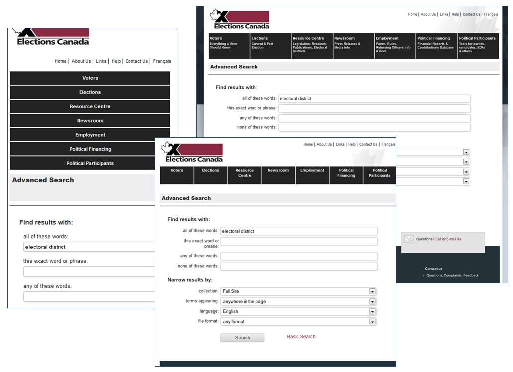
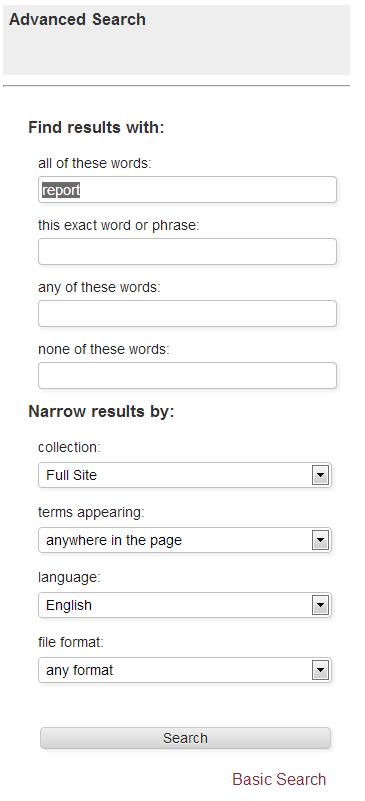
When I first started the project with Elections.ca, the GSA advanced search applications looked like the image below, which is a standard page layout, out-of-box:
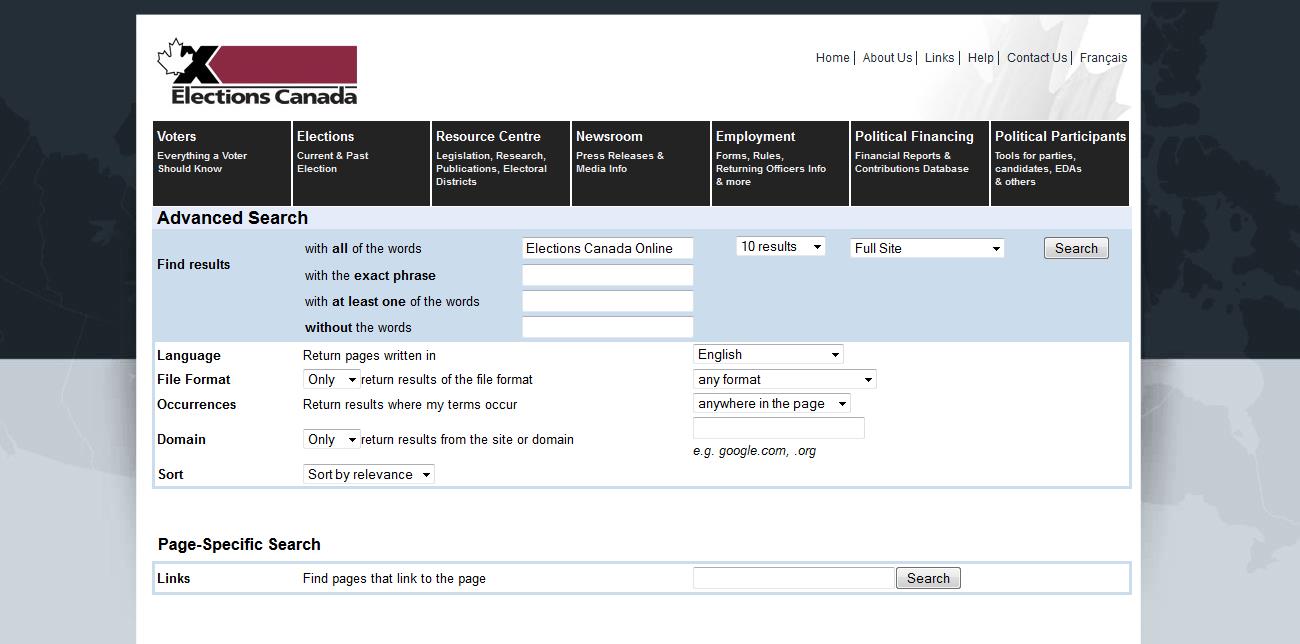
After converting the GSA advanced search to be web accessible, you obtain the following:
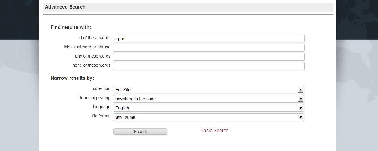
In addition to being web accessible, you must ensure that the Elections.ca search user interface is web responsive. A responsive website is one that will respond and adapt to the user’s screen size, so it is mobile compatible. The idea is to resize and reorder the page layout and adapt images with various resolutions, typographies, etc. based on the screen and/or browser size and orientation instead of providing each device a specific web page, as it has been traditionally done. As illustrated above, by removing some text fields and reordering the page layout, the new search user interface responded better to various screen sizes. For example, the GSA advanced search page would be displayed like this in a smaller screen:
Also, we ensured that the Elections.ca search page complies, as much as possible, with the guidelines defined by the government of Canada’s standards on Web Accessibility initiative, which includes such things as using only structural/semantic elements on the search page, separating the design features into a Cascading Style Sheet (CSS), and ensuring that each text field is clearly labeled.
Many countries are using the WCAG guidelines (version 2) as the benchmark for determining the accessibility of web content. In some countries, like Australia, the regulators recommend that not only the government websites comply with WCAG standards, but also corporations. But, in general, these standards apply only to government websites, not commercial sites.
In Canada, it was required that all government websites comply with the Common Look and Feel 2.0 defined by the WCAG version 1 up until July 2011. Based on a new ruling in August 2011, it is required now that all government sites update the guidelines to WCAG version 2; this were implemented in the Elections.ca website. For more details on the government of Canada’s standards on Web Accessibility, please go to http://www.tbs-sct.gc.ca/pol/doc-eng.aspx?section=text&id=23601 .
Conclusion
With the help of the XSLT style sheets, as we illustrated, it was quite possible to achieve with the Google Search Appliance. Having a search accessible and web responsive design will help ensure that a search page is up to date and users have the best possible experience, no matter how users are accessing your search application.
What do web accessibility and/or responsive web design mean to you in terms of your search user interface? Do you have a story to tell us? Of course, if you have a topic or special interest that you would like discussed, please feel free to let us know.
Stephen Jacob
Search expert with more than 10 years of software development (.NET, Java, etc) and years of experience as a specialist in various Enterprise Search products including but not limited to Autonomy IDOL, Verity and FAST Search for SharePoint 2010. He has unique practical experience in eDiscovery and has gained knowledge of the Canadian Federal Legislation procedures going back to 2003. He has created and designed various legislation software and Internet/Intranet websites.